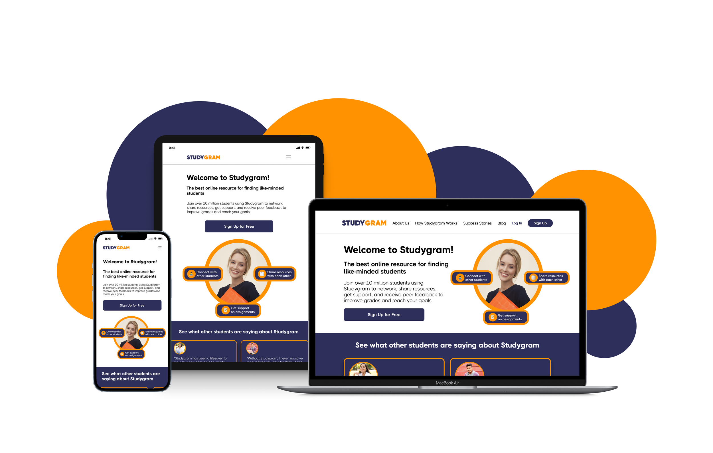
Studygram is a web app that allows students to connect with other students to get support with assignments and share resources with regards to their studies.
Overview
A key component of learning is enthusiasm. Peer-to-peer learning can increase motivation and engagement with a subject. Studygram will allow students to connect with others in their field to discuss topics, share insights, receive peer feedback on assignments, and even find others willing to collaborate on projects.
Design Goal
Create a user friendly app to help connect students online to facilitate peer-to-peer learning, foster motivation, find relevant supporting or studying materials, get advice from fellow students on studying efficiently, and receiving peer feedback.
User Persona & User Flows
Based on Alex’s description, we can tell that he wants to connect with other students and get support on his assignments. With his goals kept in mind, I created some user flows to map out how he would navigate through Studygram to complete these specific tasks.
Wireframes
After creating user flows, I began creating my low-fidelity wireframes with Figma. I decided to focus on creating the primary features first and then I created an onboarding process to make the app feel more realistic for a first time user.
Mood Board
To convey the mood and visual direction for Studygram and have more inspiration for design elements, I created mood boards. I initially came up with two mood boards to see which concept I would like to go with. After evaluating, I ended up going with the first mood board. The dark blue provides a sense of calmness and professionalism while the orange gives a splash of friendliness and welcoming.
Mood Board 1
Mood Board 2
High Fidelity Wireframes
With a color palette and vision set, it was time for me to polish and redefine my wireframes. When it comes to high fidelity I really focused more on the UI of my app. Generic shapes/icons were replaced with photos, buttons, input fields, etc. to make the app appear more realistic to the final product.
Sign Up + Onboarding
Search/Connect With/Message Other Students
Notifications/My Profile/Messages Inbox
Design System
Responsive Design Breakpoints
After finishing the mobile-first approach, I started designing Studygram for tablet and desktop breakpoints so that it can respond effectively based on the user’s device. I took into consideration how the content would scale as the screen resolution increased and how the information would be displayed. Lastly, I created some mockups to help visualize how the different screens of the web app would look on actual devices.
Landing Page - Mobile
Landing Page - Tablet
Landing Page - Desktop
Home Page - Mobile
Home Page - Tablet
Home Page - Desktop
Mockups
Prototype
Conclusion
What I’ve Learned
Challenges
Establishing a mood board and color palette before creating the high fidelity wireframes makes the design process a lot easier
Utilizing grids and establishing the gutter makes it easier to design the screen and where to place elements
Understanding the Gestalt’s Principles of Design helped make my design more user friendly and cohesive
Designing for different breakpoints and learning how to scale the content to take up more screen real estate without breaking design principles
What’s Next?
Conduct the first round of usability testing to assess Studygram’s learnability and make iterations to improve its design and usability
Create a mobile app for Studygram


